Japanese Candlestick Secrets: A Powerful Approach to Market Analysis 2025
The world of financial trading and technical analysis can often seem daunting, filled with complex jargon and intricate charts. However, one of the most powerful and visually intuitive tools available to traders is the Japanese candlestick chart. This charting method, with its rich history and clear visual language, provides a wealth of information about market sentiment and price action in a concise format. Mastering the interpretation of these charts is a fundamental step for anyone looking to make informed trading decisions, whether in stocks, forex, or cryptocurrencies. This article will serve as your comprehensive guide, delving into the history, anatomy, and key patterns of the Japanese candlestick, providing you with the knowledge to read and understand these charts like a seasoned professional.
The Origin and Evolution of Candlestick Charting
To truly appreciate the power of the Japanese candlestick chart, it is essential to understand its origins. The story begins in 18th-century Japan with a legendary rice merchant named Munehisa Homma. As a successful trader on the Dojima Rice Exchange, Homma realized that price movements were not solely determined by supply and demand, but also by the collective emotions and psychology of the market participants. He began to track and record price data in a unique way, which eventually evolved into what we now know as candlestick charting. His insights and techniques were so effective that he became known as the “God of Markets” and his methods formed the basis of Japanese investing philosophy.
For centuries, this powerful charting method remained a closely guarded secret within Japan. It wasn’t until the 1980s that a Western technical analyst, Steve Nison, discovered these charts. Nison was instrumental in bringing the technique to the attention of Western traders, publishing his seminal book, “Japanese Candlestick Charting Techniques,” in 1991. The book’s release sparked a revolution in technical analysis, and since then, the Japanese candlestick has become a cornerstone of financial market analysis around the world.
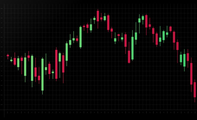
The Anatomy of a Single Candlestick
A single candlestick provides a complete picture of price action for a specific time frame. Whether you are looking at a one-minute chart or a weekly chart, each candle tells a story about the open, close, high, and low prices during that period. Understanding the components of a candle is the first step to unlocking its potential.
At the heart of the candlestick is the real body, the thick rectangular part. This body represents the range between the opening and closing prices. The color of the body is a visual cue for the direction of the price movement. A green (or white) body signifies a bullish period, meaning the closing price was higher than the opening price. In this case, the bottom of the body marks the opening price, and the top marks the closing price. Conversely, a red (or black) body represents a bearish period, where the closing price was lower than the opening price. For a bearish candle, the top of the body is the opening price, and the bottom is the closing price. This immediate visual feedback on whether a market closed higher or lower than it opened is one of the key advantages of this charting method over traditional bar or line charts.
Extending from the top and bottom of the real body are the shadows, also known as wicks or tails. The upper shadow represents the highest price the asset traded at during the period, while the lower shadow indicates the lowest price. The length of these shadows can provide further insights into the volatility and price extremes of the trading session. A long upper shadow, for instance, suggests that while buyers initially drove prices higher, sellers ultimately pushed the price back down by the close. A long lower shadow tells the opposite story: sellers tried to push prices down, but buyers stepped in to bring the price back up. The length of the shadows in relation to the body can be a powerful indicator of the strength of buyers versus sellers.
Interpreting Candlestick Patterns
Beyond the meaning of a single candle, the true power of this charting technique lies in the patterns formed by a series of candlesticks. Traders analyze these formations to identify potential trend reversals, continuations, or periods of market indecision. These patterns are not foolproof, but they offer valuable probabilistic signals that, when combined with other forms of analysis, can improve decision-making.
Single Candlestick Patterns
- Doji: This pattern is characterized by a very small or nonexistent real body, where the open and close prices are nearly identical. It often looks like a cross, a plus sign, or a hyphen. A doji signifies indecision in the market, where buyers and sellers are in a state of equilibrium. It can be a powerful signal of a potential trend reversal, especially when it appears after a long rally or decline. The length of the shadows on a doji can provide additional context about volatility.
- Hammer & Hanging Man: These two patterns are visually identical but have opposite meanings depending on their position in a trend. Both have a small real body near the top of the price range and a long lower shadow that is at least twice the length of the body. A hammer is a bullish reversal pattern that appears after a downtrend. It suggests that despite selling pressure, buyers were able to push the price back up, indicating a potential bottom. A hanging man, on the other hand, is a bearish reversal pattern that appears after an uptrend. It suggests that buying momentum is fading and sellers are beginning to gain control, signaling a potential top.
- Shooting Star & Inverted Hammer: Like the hammer and hanging man, these two patterns are also visually similar but have different implications based on the context of the trend. Both have a small real body near the bottom of the price range and a long upper shadow. A shooting star is a bearish reversal pattern that appears after an uptrend. It signifies that buyers attempted to push the price higher, but sellers stepped in to drive the price back down, indicating a potential reversal. An inverted hammer is a bullish reversal pattern found after a downtrend, suggesting a potential bottom as buyers managed to push prices up despite selling pressure.
Double Candlestick Patterns
- Engulfing Patterns: These are some of the most reliable two-candle reversal patterns. A bullish engulfing pattern occurs after a downtrend and consists of a small red candle followed by a larger green candle that completely “engulfs” the body of the previous candle. It suggests that a strong wave of buying has overpowered the recent selling, indicating a potential trend reversal. A bearish engulfing pattern is the opposite, occurring after an uptrend and consisting of a small green candle followed by a larger red candle that engulfs the first. This suggests that selling pressure has overwhelmed buying power.
- Harami: The harami is another two-candle reversal pattern, often referred to as an “inside day” in Western technical analysis. It consists of a large-bodied candle followed by a smaller-bodied candle whose entire range is contained within the body of the first candle. A bullish harami is a red candle followed by a small green candle, and a bearish harami is a green candle followed by a small red candle. The harami pattern indicates a period of indecision and potential reversal.
Triple Candlestick Patterns
- Morning Star & Evening Star: These are three-candle reversal patterns that provide a strong signal. A morning star is a bullish reversal pattern that appears at the end of a downtrend. It consists of a long red candle, followed by a small-bodied candle (often a doji or a spinning top), and a third long green candle that closes well into the body of the first red candle. This pattern represents a shift from bearish control to bullish control. The evening star is the bearish equivalent, appearing at the top of an uptrend. It consists of a long green candle, followed by a small-bodied candle, and a third long red candle that closes deep within the body of the first green candle.
- Three White Soldiers & Three Black Crows: These patterns indicate a strong continuation of a trend. The three white soldiers consist of three consecutive long green candles, each closing higher than the previous one’s close and with minimal shadows. This is a powerful bullish signal, indicating strong buying pressure. The three black crows are the opposite, consisting of three consecutive long red candles, each closing lower than the previous one’s close. This is a strong bearish signal.
Practical Application and Limitations
Understanding the theory behind the Japanese candlestick is a great starting point, but its true value is realized through practical application. Traders use these charts in various ways to inform their strategies. They can be used to identify potential entry and exit points, set stop-loss orders, and confirm signals from other technical indicators. For instance, a trader might use a moving average to determine the overall trend, but use a candlestick reversal pattern like a bullish engulfing to pinpoint an optimal entry point for a long position.
While candlestick patterns offer a valuable perspective on market sentiment, it’s crucial to acknowledge their limitations. They should never be used in isolation. Candlestick patterns are most effective when they are confirmed by other technical analysis tools, such as trend lines, support and resistance levels, volume indicators, and oscillators like the Relative Strength Index (RSI). A hammer pattern at a strong support level, for example, is a much more reliable signal than a hammer that appears in the middle of a price range with no other context.
Furthermore, it is important to consider the timeframe you are using. Patterns on a daily or weekly chart tend to be more significant and reliable than those on a five-minute chart, as they represent a longer period of market consensus. The longer the timeframe, the more weight you can generally give to a pattern.
Conclusion
The Japanese candlestick chart is an invaluable tool for any serious trader. Its intuitive visual design allows for a quick and easy assessment of market dynamics, while the patterns it forms provide a historical and psychological context to price movements. From its origins with a rice trader in 18th-century Japan to its global adoption today, this charting method has stood the test of time.
By learning to identify and interpret the various components and patterns, you can gain a deeper understanding of market sentiment and improve the timing of your trades. Remember to always use candlestick analysis in conjunction with other tools and to consider the broader market context. With practice, you will find that these seemingly simple charts offer a powerful window into the “why” behind the “what” of price action.